Chatbot Interface Design by Answer Type: When to Use Buttons, a List, a Text Box or a Card for Each Question (Free Control Picker)
Chatbot interface design is mostly one decision repeated: for each question the bot asks, how should the visitor answer it? Tap a button, scan a list, type a word, or press a link? Get that choice right and a chat feels quick. Get it wrong and people face nine buttons for a yes-or-no question, or a blank box where four taps would do. This guide gives you simple rules based on the type of answer, worked examples, and a free tool that picks the control for every step of your bot and flags the steps people are likely to abandon.
⚡ In short
- Look at the answer, not the question. The number and type of possible answers decides the control.
- Two to four short options: buttons. Five to seven: a list. Eight or more: a text box with the top three as buttons.
- Emails, phone numbers and order numbers must be typed. Show the format and ask for them after you’ve helped.
- Good chatbot interface design always leaves the text box open and always offers a way out, such as “Something else”.
Why controls matter
Most chat friction is the wrong control, not the wrong words
When a bot feels slow or annoying, owners usually rewrite the messages. Often the words were fine. The problem was what the visitor had to do to answer.
Think about the last time a bot asked you to pick your city from a row of fourteen buttons that wrapped across three lines on your phone. Or asked “Would you like to book a demo?” and showed only a text box, so you had to type “yes”. Or asked for your email in the very first message, before telling you anything. None of those are writing problems. They’re control problems.
Every step in a bot conversation has a question and an expected answer. The answer has a shape:
- A choice from a few options, such as which service, which branch, yes or no.
- A choice from many options, such as which city, which product, which course.
- A fact only the visitor knows, such as an email, phone number, order ID or pin code.
- Something open, such as describing a problem or adding a note.
- An action, such as opening a page, paying or tracking an order.
Each shape has a control that suits it. Match them and the chat moves at the speed of a thumb. Mismatch them and every step costs a few extra seconds and a little patience. Across six or seven steps, that’s the difference between a finished enquiry and a closed tab.
If you want the bigger picture of what sits in a chat window (header, bubbles, input box, footer), our chatbot UI anatomy guide covers each part. This guide zooms in on one thing only: picking the right way to answer at every step.
The toolkit
Chatbot interface design toolkit: six controls and their jobs
Almost every chat interface is built from these. You rarely need anything more exotic.
Quick-reply buttons
Short labels under a bot message. Best for 2 to 4 options. One tap answers the question. Keep labels under about 20 characters so they don’t wrap on a phone.
Tappable list
Options stacked one per row. Best for 5 to 7 options, where a row of buttons would wrap into a jumble. Easier to scan top to bottom.
Text box plus top picks
For 8 or more options: show the three most common as buttons and let everyone else type. Nobody scrolls through 30 cities.
Typed field with a hint
For facts only the visitor knows: email, phone, order number, pin code. Say what format you want, e.g. “10-digit mobile number”.
Open text box
For answers you can’t predict: “Tell us what went wrong.” Ask one specific question so the reply stays short.
Card with a link button
For actions that leave the chat: open the fee page, track an order, chat on WhatsApp. One clear button, not a link inside a paragraph.
Rule 1
Count the possible answers before you choose
The quickest test is to write down every answer a visitor could reasonably give, then count.
Two answers usually means yes or no. Use two buttons, labelled with what happens: “Yes, book a demo” and “Not now” are clearer than “Yes” and “No” when the question is long. Keep the text box open below them, because some people will type “maybe next week” and that’s useful information.
Three or four answers fit neatly as quick-reply buttons. This is the sweet spot of chat design: the visitor sees every option at once and answers with one tap. “Course fees”, “Batch timings”, “Free demo class”, “Something else” is a good opening menu for a coaching institute.
Five to seven answers are where buttons start to fail. On a phone, seven buttons wrap into three or four uneven rows and people miss the one they want. Stack them as a list instead, one per line, in an order that makes sense: by popularity, by geography, or alphabetically if there’s no obvious order.
Eight or more answers shouldn’t be shown in full at all. Pick the three most common from last month’s enquiries, show those as buttons, and let everyone else type. A visitor from Vashi types “Vashi” faster than they can find it in a list of twelve branches.
One answer isn’t a question. If a step only has one option, such as “Continue”, ask whether it needs to exist. Often it can be merged into the next message or turned into a link button.
This counting rule handles most decisions. The next two rules cover the cases it doesn’t.
Quick reference
Answer type to control, at a glance
| The visitor answers with | Use | Example |
|---|---|---|
| Yes or no | Two buttons, text box still open | “Would you like a free demo?” → Yes, book it / Not now |
| One of 3–4 options | Quick-reply buttons | Fees / Timings / Demo / Something else |
| One of 5–7 options | Tappable list | Five branches, one per row |
| One of 8+ options | Text box + top 3 buttons | Mumbai / Pune / Delhi, or type your city |
| A day or time | Day chips + pick a day | Today / Tomorrow / Pick a day |
| Email, phone, order ID | Typed field with a format hint | “Your 10-digit mobile number” |
| Something open | Open text box | “What should the teacher know?” |
| An action | Card with one link button | “Open fee details page” |
Rule 2
Facts only the visitor knows must be typed, so make typing easy
Some answers can’t be buttons. You can’t offer someone a menu of email addresses. For these steps, good chatbot interface design is about reducing typing mistakes and asking at the right moment.
Say the format
Put the expected format in the question or the placeholder: “Your 10-digit mobile number”, “Your order number (it starts with #, in your confirmation email)”. Visitors in India often add +91, spaces or a leading zero to phone numbers. Accept all of them and clean them up afterwards, rather than replying “Invalid number”.
Repeat it back
After someone types an email or phone number, repeat it in the next message: “Thanks, we’ll send the details to priya@example.com.” A typo caught now saves a lost lead later.
Ask after you’ve helped
The most common mistake is asking for contact details first. A visitor who asked “What are your fees?” and got “Please share your phone number” will often leave. Answer the question, then offer something worth a number: “Want us to send the full batch schedule on WhatsApp?” Our lead collection guide goes deeper on timing.
Ask only what you’ll use
If the next message won’t use the visitor’s name, don’t ask for it. Each typed field costs ten seconds or so on a phone, and three typed steps in a row is where many people stop answering.
Free tool
Pick the right control for every step of your bot
List the questions your bot asks, in order. Add options after a | if the visitor picks from a set. The tool suggests a control for each step, flags long labels, missing escape options, early contact requests and runs of typing, and estimates the effort for a phone visitor.
List every question your bot asks, one per line, in order. If the visitor picks from options, add a | and the options separated by commas. Example: Which branch? | Andheri, Thane, Vashi
Runs only in your browser; nothing is sent or saved. The time estimate is a rough guide, not a measurement.
Rule 3
Always leave a way out
Buttons speed things up, but they can also trap people. A visitor who wants something you didn’t list has nowhere to go if the only options are your four buttons.
Two habits prevent that.
Keep the text box open at every step. Even when you show buttons, let people type. Some will ignore your buttons entirely and type their question. That’s fine: a bot that answers typed questions, like LiveChatBot’s AI Agent, can handle it, and your team sees it in the inbox if it can’t.
Add an escape option to every menu of three or more. “Something else”, “Ask a different question” or “Talk to a person” as the last button. It costs one line and catches every visitor your menu didn’t predict. The tool above flags menus that lack one.
The same goes for the end of a flow. When the bot has finished, say what happens next and offer one more step: “Our team will call you before 6 pm. Anything else I can help with?” A dead end with no button and no question makes people unsure whether the chat is over.
If your bot has longer branching paths, our guide to planning chats with no dead ends shows how to map them before you build.
Before and after
Illustrative coaching institute bot, redesigned step by step
A made-up example for illustration. Same questions, better controls.
Sequencing
Order the steps so taps come first and typing comes last
Once each step has the right control, look at the whole sequence. The order matters as much as the controls.
Start with taps. The first two or three steps should be buttons or lists. They’re easy, they show the visitor the bot is useful, and they build a little momentum. A visitor who has already tapped three times is far more likely to type a phone number than one who’s asked to type on step one.
Give something before you ask for something. Put the answer, the price range or the available slot before the contact request. The tool flags any email or phone step in the first two positions.
Never stack three typed steps. Name, then email, then phone, then “anything else?” is four typed steps in a row. On a phone keyboard, that’s a lot of work. Drop the ones you don’t need, or split them with a tap step (such as choosing a callback time).
Keep the whole thing short. Most website chats should reach their goal in five to seven steps. If yours is longer, look for steps you ask “just in case” and remove them.
Check the effort estimate. The tool gives a rough figure in seconds, using about two seconds per tap, ten per short typed field and twenty per open answer. These are rough guides, not measurements, but they make comparisons easy: if a redesign cuts the estimate from 90 seconds to 45, you’ve removed real work for your visitors.
Our chatbot UX design guide covers what to measure once the bot is live, so you can see whether fewer people drop off.
In LiveChatBot
Where these controls live in a ready-made widget
If you use a ready-made tool rather than coding your own interface, you won’t build each control from scratch. You’ll choose where each kind of answer happens. Here’s how the rules above map onto LiveChatBot:
- Typed questions and open answers go to the chat box. The AI Agent answers from the knowledge you give it, and when AI replies aren’t available the free keyword bot answers from your saved replies. Your team picks up the rest in the inbox or the Android app.
- Action steps suit widget cards: a WhatsApp button card, call, email or link cards that open a page in one tap. Our widget cards guide shows how to plan them.
- Proactive questions come from Chat Flows: a message shown on a chosen page or to chosen visitors, with a follow-up if they don’t reply.
- Contact details after hours come through the away form, which collects an email or phone number when nobody is online.
- Your own buttons on the page can open the chat or send a message for the visitor through the JavaScript API (window.LiveChatBot with open and sendMessage), so a “Ask about fees” button on your fee page starts the right conversation.
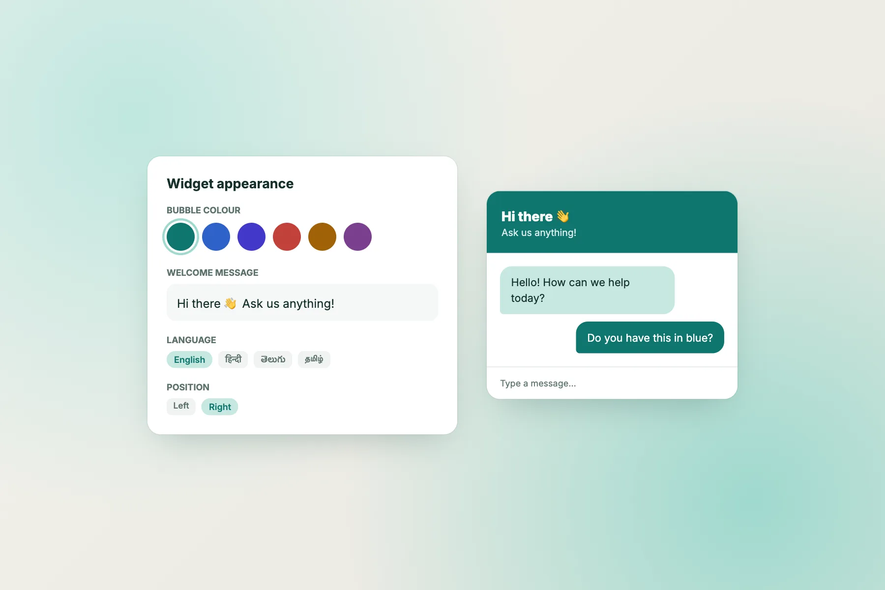
LiveChatBot doesn’t have a pre-chat form, so the “ask after you’ve helped” rule comes naturally: visitors start by asking, and you collect details when they’re useful. To set the widget’s colour, position, team name and welcome text, see how to customise your chat widget.
Checklist
Control check for every bot step
Getting started
Redesign your bot’s controls in 30 minutes
Write out every question your bot asks, in order, with its options. Paste the list into the control picker above. For each step, compare what you have now with what the tool suggests, and fix the steps marked “Fix” first: missing escape options, early contact requests and runs of typing usually matter most.
Then test it on your own phone. Go through the whole chat with one thumb. Anywhere you have to scroll, zoom or think about what to press, there’s still work to do. Our chatbot button guide helps with the launcher button itself, and our chatbot interface microcopy guide helps with the words around each control.
LiveChatBot’s free plan includes the widget with cards, the AI Agent with a small free monthly allowance, the free keyword bot, Chat Flows, the team inbox and the Android app, for two websites with 100 visitors per website each month. See pricing and start at livechatbot.in.
Frequently asked questions
What is the most important rule in chatbot interface design?
Choose the control from the answer, not the question. Count the possible answers: two to four suit buttons, five to seven a list, eight or more a text box with the top three shown as buttons.
Should a bot use buttons or let people type?
Both. Show buttons when there are a few common answers, and keep the text box open so people can type anything else. Facts like emails and phone numbers always need typing.
How many quick-reply buttons is too many?
More than four usually wraps awkwardly on a phone. Switch to a list for five to seven options and to typing with top picks for eight or more.
When should the bot ask for a phone number or email?
After it has helped: once the visitor has an answer or has chosen an offer like a demo or callback. Asking first makes many visitors leave.
Does the control picker tool save my bot questions?
No. It runs entirely in your browser and nothing is sent or saved.
Keep reading
Related guides
Chatbot Interface Microcopy: Rewrite the 8 Small Lines in Your Chat Window That Decide Whether People Type
Chatbot Games You Can Build Yourself: Write a Branching Story Bot, Play It, and Learn How Every Chat Bot Thinks
Chatbot Free for Freelancers and Solo Consultants: Sort Enquiries While You Work, Not Instead of Working
Make every step one tap or one clear question
Set up your widget, cards and Chat Flows, and let the AI Agent handle typed questions. Start free on livechatbot.in.