Chatbot UI Anatomy: The 7 Parts of a Chat Window and How to Get Each One Right
Chatbot UI is easier to improve when you stop looking at the chat window as one thing and start looking at its parts. A chat window has seven of them, from the header at the top to the small footer at the bottom, and each has its own job, its own rules and its own common mistakes.
⚡ In short
- The header builds trust, the bubbles carry the conversation, the input box invites a reply.
- Quick replies speed up common paths but should never trap the visitor in a menu.
- On phones, the chat window should fill the screen and keep the input box above the keyboard.
- Most chat window problems come from long messages, not visual design.
Why anatomy
Seven parts, seven jobs
People judge a chat window in a second or two. In that time they decide whether it looks trustworthy, whether someone is there, and whether it’s worth typing a question. Those judgements come from specific parts of the interface: the face and name in the header, the first message, the look of the input box. Improving the whole window at once is overwhelming. Improving one part at a time is easy.
This guide takes the parts in the order a visitor experiences them: header, bot bubbles, visitor bubbles, quick replies, indicators, input box and footer. For each, you’ll find its job, the rules that make it work, and the mistake to avoid. If you use a ready-made widget such as LiveChatBot’s, most of the structure is done for you, and your job is to fill each part with the right content and settings. If you are building your own chatbot UI, the same rules apply to your design.
A note on the launcher
The round button that opens the chat is part of the experience too, but it lives outside the window and has its own design rules. We cover it separately in the chatbot button guide.
Part ① · Header
The header answers ‘who is this?’
Its job
Tell the visitor who they’re talking to and whether anyone is around. It’s the part of the window that builds trust before a word is exchanged.
Rules
- Show a real team name or business name, not ‘Chat’.
- Use a photo of a person or your logo. Faces feel warmer.
- Show status honestly: online, or ‘replies in a few hours’.
- Keep a clear close or minimise button.
Mistake to avoid
A green ‘online’ dot when nobody is watching. Visitors wait, get no reply, and trust the whole site less. Set opening hours so status is accurate.
Part ② · Bot bubbles
Bot messages carry most of the experience
This is where most chat windows succeed or fail, and it’s about words more than visuals.
Its job
Deliver answers the visitor can read in a glance on a phone screen.
Rules
– Answer first. The first sentence should contain the answer: the price, the time, the yes or no. – Two or three sentences. If an answer needs more, split it into two bubbles or offer a link. – One idea per bubble. A bubble that covers delivery and returns and payment is three bubbles. – Links with clear names. “See delivery times” beats a raw web address. – Readable size. Text should be at least 15–16 pixels on phones.
Part ③ · Visitor bubbles
The visitor’s side should feel like a messaging app
Visitor bubbles get less attention because the bot doesn’t write them, but their design affects how comfortable people feel typing.
Its job
Show the visitor their own messages clearly, separate from the bot’s, so the conversation is easy to follow.
Rules
– Opposite side, different colour. Visitor bubbles usually sit on the right in a darker or brand colour; bot and team bubbles on the left in a lighter colour. This mirrors messaging apps people use every day. – Show delivery. A small ‘sent’ or tick tells the visitor their message went through. Without it, people resend. – Keep their words. Never ‘correct’ what the visitor typed in the display. It feels like being edited.
Mistake to avoid
Low contrast between the two sides. If bot and visitor bubbles are both pale grey, long conversations become hard to scan. Use clearly different colours, and check them in dark mode if your site has one.
Part ④ · Quick replies
Buttons that speed things up, without trapping anyone
Quick replies are tappable suggestions shown under a message.
When they help
- Opening choices: ‘Delivery’, ‘Returns’, ‘Talk to a person’.
- Yes/no confirmations: ‘Book it’, ‘Not now’.
- Picking from a short list: three time slots, two plans.
When they hurt
- Long menus of eight or more options.
- When they’re the only way to reply and the visitor’s question isn’t listed.
- Deep menu trees, where visitors tap four times and still haven’t asked their question.
The golden rule
Always keep the text box open alongside quick replies. Buttons should be shortcuts, not walls. And always include a way to reach a person.
Part ⑤ · Indicators
Typing dots, timestamps and status lines
Indicators are the small signals that make a conversation feel alive. They’re easy to overlook and easy to overdo.
Typing indicator
The three moving dots show that a reply is coming. For a person typing, they reassure the visitor not to leave. For a bot, a short indicator (under a second or two) makes the reply feel less abrupt, but long artificial delays only waste the visitor’s time.
Timestamps
Show times on messages, especially when a conversation resumes later. “Yesterday, 6:40 pm” tells the visitor where they left off. Many chat windows show the time only on hover or for the first message in a group, which keeps things clean.
System lines
Short grey lines such as “Priya joined the chat” or “Chat assigned to the sales team” explain what’s happening during a handover. They’re far better than silence while the visitor waits for a person.
Mistake to avoid
Fake typing indicators that run for five or ten seconds to make a bot ‘seem human’. Visitors don’t want a bot that seems human; they want quick, correct answers.
Part ⑥ · Input box
The input box is an invitation to type
Its design quietly tells visitors what kind of question is welcome.
Its job
Make typing a question feel easy and expected.
Rules
– Helpful placeholder. “Ask about delivery, sizes or your order…” works better than “Type a message”. – Big enough. At least one comfortable line, growing as the visitor types longer messages. – Enter to send on desktop, a clear send button on phones. – Attachments when useful. For support, photos of damaged items or error screens save a lot of back-and-forth. – Above the keyboard on phones. If the phone keyboard covers the input, visitors can’t see what they type.
Mistake to avoid
Disabling the input box until the visitor chooses from buttons or fills in a form. It feels like being put on hold before you can speak. If you need contact details, ask for them in the conversation once you’ve been helpful, or when a person needs to follow up.
Pre-chat forms
LiveChatBot deliberately has no pre-chat form: visitors can type straight away, and contact details are collected by the away message when your team is offline or by Flows that ask for an email in exchange for something useful.
Part ⑦ · Footer
The smallest part, with the quietest job
The footer sits under the input box. On many chat windows it shows a small ‘Powered by’ line, sometimes a privacy link or an emoji picker.
Its job
Stay out of the way while giving any legally or practically necessary information.
Rules
– Keep it to one short line in small, low-contrast text. – Link to your privacy policy if you collect personal details in chat. – Don’t add promotions or banners here; they compete with the input box.
On LiveChatBot the ‘Powered by LiveChatBot’ line stays on every plan, including paid ones. It’s small and sits below the input, so it doesn’t interfere with the conversation.
Phones
The chatbot UI on a phone is a different design
Most visitors meet your chat on a small screen. Check these on your own phone.
Customising
What you can change on a ready-made widget
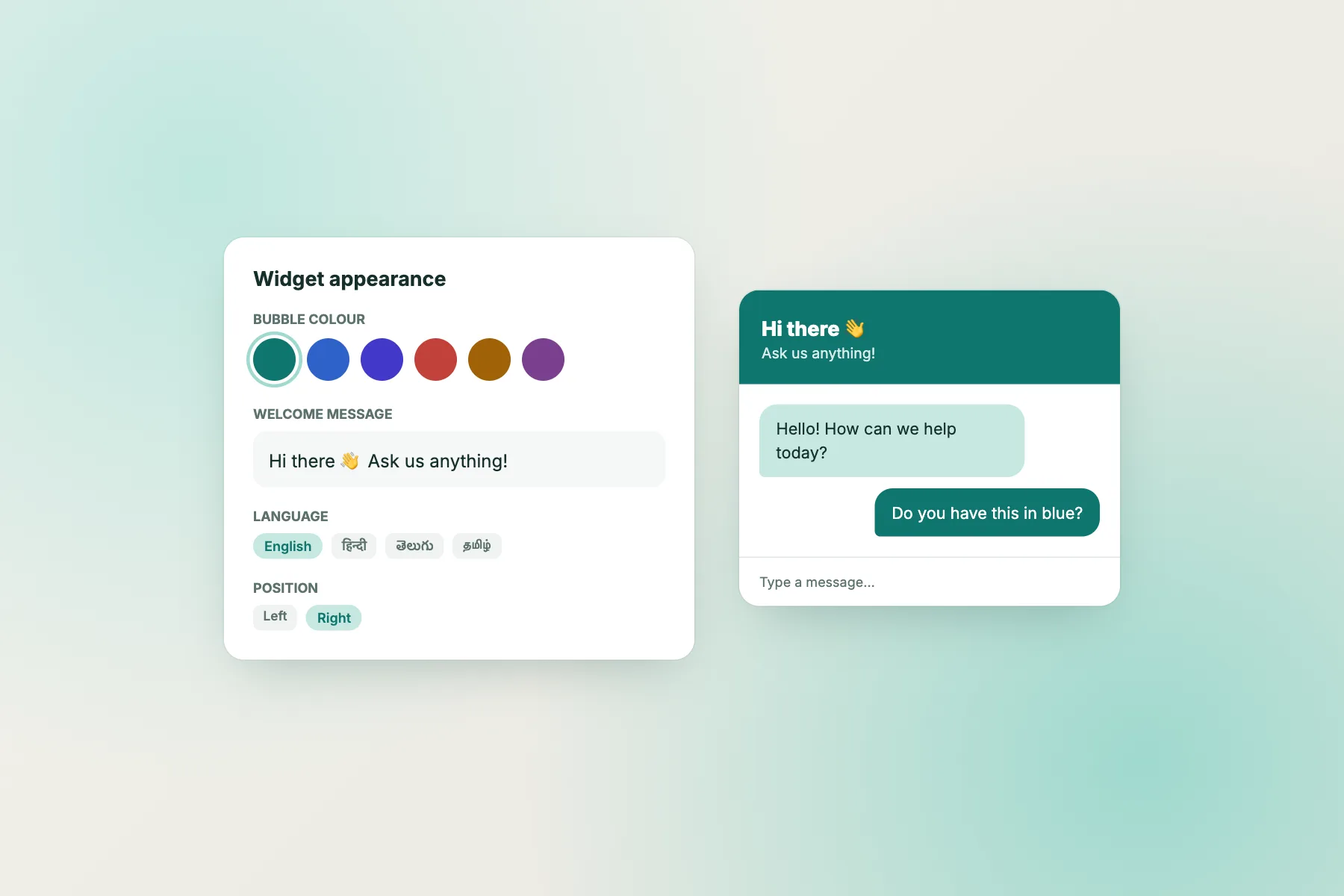
Most businesses don’t build a chat window from scratch; they customise a ready-made one. With LiveChatBot you can set the main colour, position (left or right), team name and photo, welcome message, attention card, widget cards (such as a WhatsApp button or a link), language, and where the chat shows. The customisation guide shows each setting, and the website chat widget page compares the display styles: floating bubble, inline in a page, or full page.
Inline mode
If you’d rather show the chat inside a page section, such as on a contact page, the widget can run inline in a container you choose, instead of floating. This works well where you want chat to be the main way to get in touch.
What to change first
If you only have ten minutes: set your brand colour, add a real team name and photo, rewrite the welcome line to name your most common question, and check the window on your phone. Those four changes do more than any other tweaking.
Frequently asked questions
What is a chatbot UI?
It’s the visible part of a chatbot: the chat window with its header, message bubbles, quick-reply buttons, input box and footer, plus the launcher button that opens it.
Should a chatbot UI use buttons or free text?
Both. Quick-reply buttons speed up common paths, while the text box lets visitors ask anything. Never hide the text box behind buttons.
How long should bot messages be?
Two or three short sentences per bubble, with the answer in the first sentence. Longer answers should be split or linked.
Can I change the look of LiveChatBot’s chat window?
Yes: colour, position, team name and photo, welcome text, attention card, widget cards and display mode. The small ‘Powered by LiveChatBot’ line stays.
Does the chat window work on phones?
Yes. It’s built to open full-screen on phones, with the input above the keyboard.
Keep reading
Related guides
Chatbot Examples From 10 Industries: Opening Lines, Conversations and Why They Work
Chatbot Customer Service Rulebook: Who Answers What, and When the Bot Steps Aside
Chatbot Button Design: Placement, Labels and Custom ‘Ask Us’ Buttons That Get Clicked
Get every part right in an afternoon
Install the widget free on livechatbot.in, then work through the seven parts above.