UI for Chatbot Branding: Matching Colours, Avatar, Fonts and Voice to Your Website
UI for chatbot branding decides whether your chat window feels like part of your business or like a stranger’s pop-up stuck onto the corner of your site. Visitors notice within a second. This guide covers the four branding choices that matter, colour, avatar, typography and voice, and shows how to make each one match your website without hurting readability.
⚡ In short
- Use one main brand colour for the header and visitor bubbles; keep bot bubbles light and readable.
- A real face or your logo as the avatar builds more trust than a generic robot icon.
- Let the chat follow your site’s look, but never sacrifice contrast or text size for style.
- The voice matters as much as the visuals: write the welcome line the way your team talks.
Why branding matters
A chat window that looks foreign gets ignored
Visitors have learned to ignore things that look like adverts. A chat bubble in a colour that clashes with your site, with a generic robot icon and a stock “How may I help you?”, triggers exactly that reflex. It looks like a third-party add-on, which it technically is, and visitors treat it as something to close.
A chat window that matches your brand does the opposite. Same colours as your buttons, your logo or a team photo in the header, a welcome line in the same voice as your website copy. It reads as part of your business, and visitors are more willing to trust it with a question.
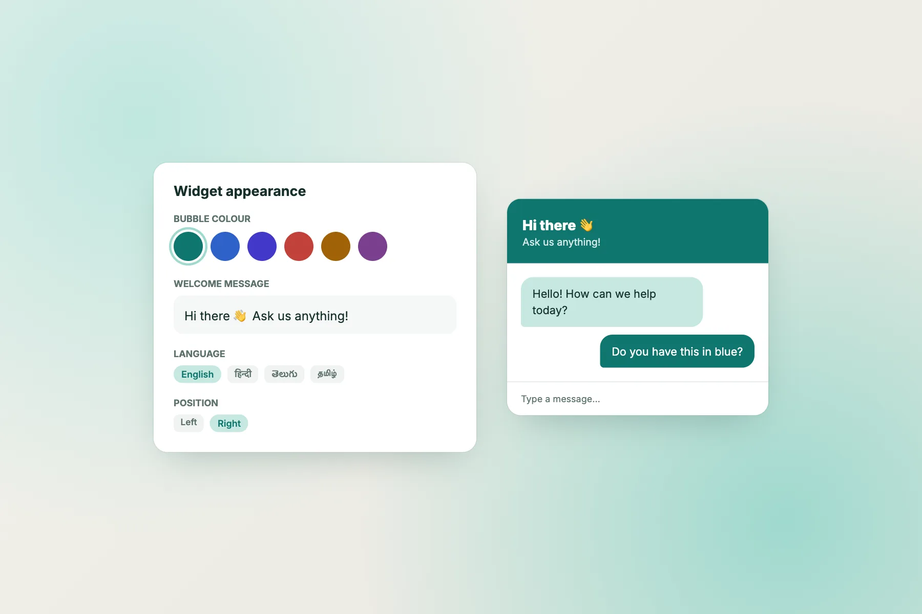
Good UI for chatbot branding isn’t a big design project. On most chat tools, including LiveChatBot, it means a handful of settings: colour, name, avatar, welcome text and position. The skill is in choosing them well, and in knowing where branding should give way to readability. If you’d like the full anatomy of a chat window first, read the chatbot UI guide; this page is about making it look and sound like you.
Choice 1 · Colour
One brand colour, used in the right places
Colour is the strongest signal in any UI for chatbot branding, and the easiest to get wrong. Most mistakes come from using the brand colour everywhere instead of in a few deliberate places. The goal is a chat window that’s recognisably yours and still easy to read.
Find your colour
Use the main colour of your website’s buttons, usually the colour of your “Buy”, “Book” or “Contact” button. Your website theme settings will show it as a hex code, such as #0f766e. Using the same code makes the chat feel native.
Where to use it
– The launcher button, so it’s recognisable. – The chat header, with white or very light text on top. – Visitor message bubbles, so the visitor’s side carries your colour.
Where not to use it
– Bot and team bubbles should be a light neutral or a pale tint of your colour, with dark text. Full-colour bubbles on both sides make long conversations tiring to read. – Large backgrounds in a strong colour behind text.
Check the contrast
Text on your brand colour must be easy to read. White text on dark teal, navy, deep red or black is fine. White text on yellow, light green or pastel pink usually fails. Free online contrast checkers will tell you whether a pair meets the WCAG contrast guidance; aim to pass for normal-size text. If your brand colour is light, use it for accents and choose a darker shade for the header.
Choice 2 · Avatar
A face, a logo, or a robot?
The small image in the header and next to messages has a big effect on trust.
Team photo
Feels: personal, warm, local.
Best for: small businesses where customers know the owner or team, such as salons, clinics, tutors and local shops.
Tip: a friendly, well-lit photo cropped to the face. Group photos are too small to see.
Your logo
Feels: professional, consistent with the brand.
Best for: online stores, software companies and businesses with several people answering.
Tip: use a square version of your logo with enough padding to look good in a small circle.
Illustrated character
Feels: playful, approachable.
Best for: brands with a mascot or a casual, fun style.
Tip: avoid generic robot icons; they remind visitors of frustrating bots elsewhere. And don’t use a stranger’s stock photo, which feels fake.
Honesty about bots
If a bot answers first, a photo of a real person can be misleading. A common approach is to use your logo for the bot and show team members’ photos when a person joins. The guide on telling visitors honestly whether they’re talking to a bot has wording you can copy.
Choice 3 · Typography
Fonts and sizes that match without straining eyes
Most chat widgets use a clean, standard font that suits almost any website. That’s usually the right choice: readability matters more than matching your headline font exactly.
Size first
Message text should be at least 15–16 pixels on phones. If your website uses a larger body size, a slightly larger chat font keeps things consistent.
Weight and spacing
Regular weight for messages, bold only for the team name or important words. Generous line spacing (around 1.4–1.5) makes multi-line messages easier to read.
Decorative fonts
Script or display fonts that look lovely in your logo are hard to read in a chat bubble. Keep them for the logo image and use a plain font for messages.
Emoji
A few emoji can match a friendly brand, such as a 👋 in the welcome line. Too many make messages harder to scan and can look unprofessional for some businesses. Match your website’s style: if your site never uses emoji, your chat probably shouldn’t either.
Choice 4 · Voice
The words are part of the interface
Visitors read your chat’s tone as quickly as they see its colour.
Write like your website
Read your homepage out loud. Is it formal or casual? Short sentences or long ones? “We” or “I”? Write the chat’s welcome line, offline message and handover line in that same voice. The guide on chatbot personality helps you pick a voice and stick to it, and how to write a welcome message has thirty examples.
Position and size
Where the chat sits is part of the brand too
Branding isn’t only colours and words. Where the chat appears, and how it behaves, also tells visitors what kind of business you are.
Corner and offset
Bottom right is standard; bottom left works if your site has something important on the right, such as a cart summary or a cookie banner. Keep the launcher clear of your main buttons on phones.
Attention card
A small card next to the launcher with a short line, such as “Questions about delivery? Ask us”, draws attention politely. A brand with a calm style might skip it; an energetic store might use it on product pages.
Display style
A floating bubble suits most sites. A full-page or inline chat on your contact page suits businesses where chat is the main way to get in touch. Our chat box designs comparison shows six styles side by side.
Consistency
Same position, colour and voice on every page. A chat that changes look between pages feels unreliable.
Dark sites
If your website uses a dark theme
Dark websites need a little extra thought, because most chat widgets are designed light by default. A bright white chat window on a black site can feel jarring, like a light switched on in a dark room.
Keep the window readable
Whatever the site’s look, the inside of the chat window should have strong contrast: dark text on a light background, or light text on a dark one. Avoid mid-grey text on dark grey; it’s hard to read on phones outdoors.
Use your accent colour for the frame
On a dark site, your accent colour, often a bright teal, orange or purple, works well for the launcher and header, tying the chat to your buttons and links.
Test at night and in daylight
Open the site on your phone in a dark room and outside in sunlight. If either is uncomfortable, adjust the header colour or bubble shades until both are easy on the eyes.
Checklist
Brand your chat in 20 minutes
Tick each as you set it up.
Testing
Ask someone else to look
You’ve looked at your website so often that you can’t see it fresh, and the same is true of the UI for chatbot settings you’ve just chosen. A second pair of eyes catches what you’ve stopped noticing. Once your chat is branded, ask two or three people who don’t work with you to open your site on their phones and tell you, in one sentence each, what they think the chat bubble is and whether it looks like part of your business. If anyone says “an advert” or “some app”, something is off: usually the colour, the avatar or a generic welcome line.
Then ask them to open it and send a question. Watch where they hesitate. Small branding decisions often turn out to matter for practical reasons: a header colour that makes the close button hard to see, an avatar that looks like a different company, a welcome line that doesn’t say what you can help with.
All of the settings on this page are available on LiveChatBot’s free plan, for two websites. Start on livechatbot.in and follow the customisation guide. The “Powered by LiveChatBot” line stays on all plans, small and below the input box, so your own branding stays front and centre.
Frequently asked questions
What does UI for chatbot branding include?
The chat window’s colours, avatar, team name, fonts, welcome text, offline and handover messages, position and display style.
Should the chat use exactly my brand colour?
Use it for the launcher, header and visitor bubbles, as long as text on it is readable. If your colour is light, use a darker shade for the header.
Is a robot avatar a good idea?
Usually not. Generic robot icons remind visitors of frustrating bots. Use your logo for the bot, and real team photos when people join.
Can I remove ‘Powered by LiveChatBot’?
No, it stays on all plans. It’s small and sits below the input box.
Do I need a designer?
No. Picking your button colour, uploading a logo and writing a welcome line in your own voice gets you most of the way.
Keep reading
Related guides
Online Talk Website Safety: How to Choose One, Red Flags to Avoid, and Rules for Talking to Strangers
Livechat Software Pricing Models Explained: Per Seat, Per Visitor, Per Conversation, and What You’ll Really Pay
Make the chat look and sound like you
Set your colour, avatar and voice free on livechatbot.in in about twenty minutes.