Chat Option in Website Layouts: Bubble, Pill, Grabber Card, Inline Box or Full Page? Pick the Right One for Each Page (Free Layout Quiz)
Chat option in website design means more than a round button in the corner. You can show a bubble, a pill with words, a small grabber card that says hello, a box inside the page, or a full-page chat reached by a link. Each suits a different visitor and a different page. This guide explains all five, says when to use each, and ends with a short quiz that picks one for you.
⚡ In short
- A bubble or pill suits most pages and keeps out of the way.
- A grabber card adds a short greeting beside the bubble for pages where people hesitate.
- An inline box suits one page about one thing, such as a course or a quote form.
- A full-page chat link suits emails, QR codes and social bios.
Why layout matters
The same chat gets different results in a different shape
People rarely ignore chat because they have no questions. They ignore it because it looks like an ad, or sits where they are trying to read, or says nothing about what to ask.
Layout is the cheapest thing you can change. It needs no new text, no new bot and no developer. A pill that says Ask us about delivery reads very differently from a silent circle. A greeting card on a pricing page lands better than one on a blog post.
So think of your chat option in website pages as a set of tools. You do not need to use them all. You need to know what each is for, so that you can match the tool to the page. Our live chat overview shows the full picture; this page zooms in on the shape of the chat itself.
The five layouts
What each chat layout does and when it fits
1. The bubble
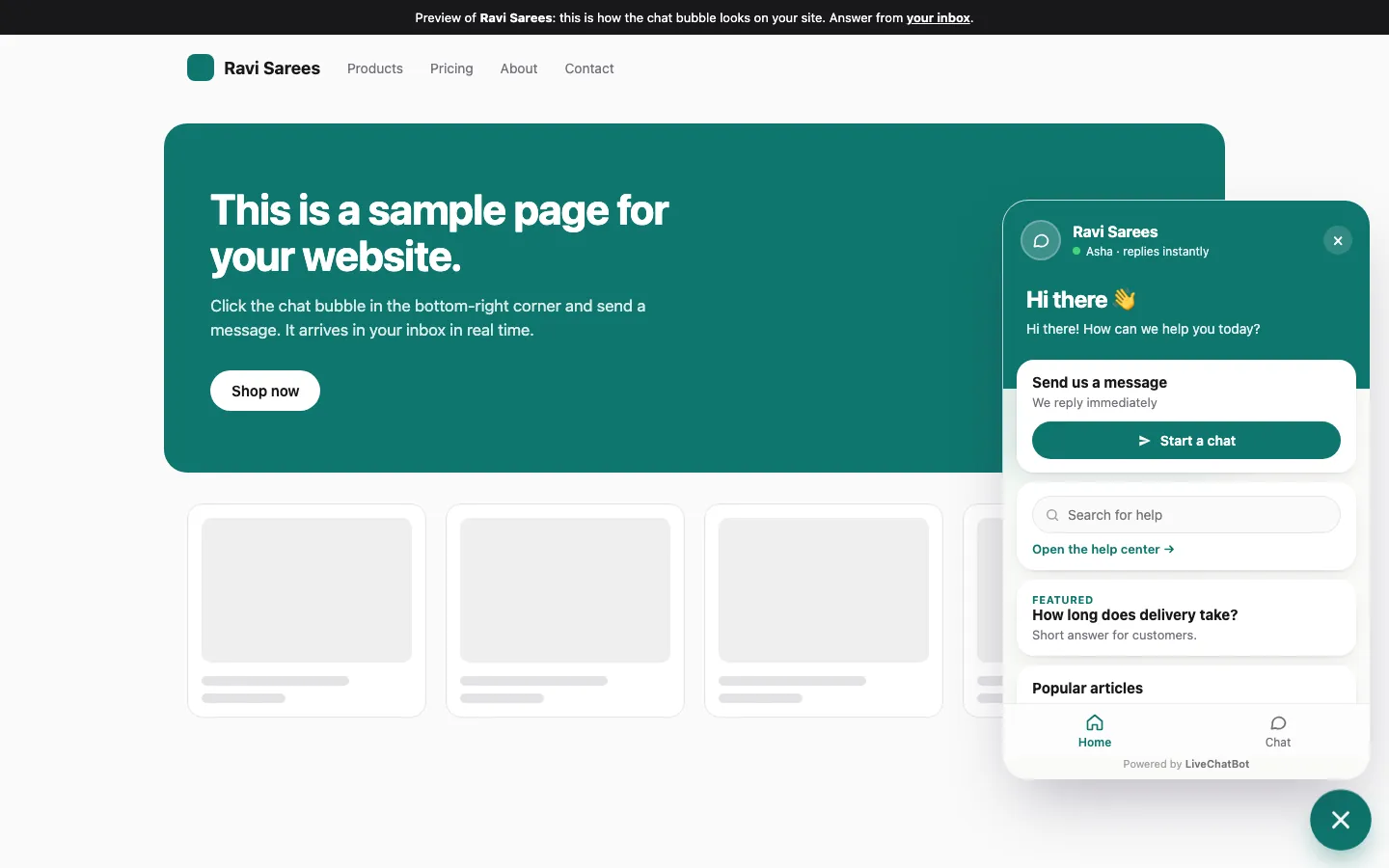
A round button in a corner. It is quiet, familiar and works on phones. Use it by default.
2. The pill
The same button with words, such as Chat with us. It is easier to notice on a computer, because the words tell people what happens when they click.
3. The grabber card
A small card beside the bubble with a short greeting. It is an attention grabber, not a full pop-up. Good for pricing, contact and checkout-help pages.
4. The inline box
Chat that sits inside the page, not floating over it. Good for a landing page where the chat is the main action.
5. The full-page chat
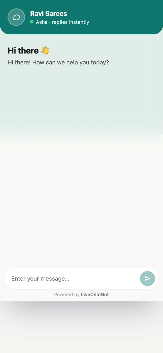
A link that opens a chat on its own page. Share it in an email, a QR code or a social profile. It also works well on a phone, where a full screen is easier than a corner box.
Real screens
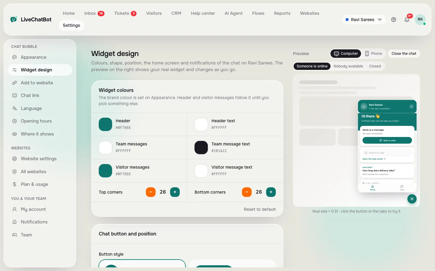
The widget design settings, the chat on a website, and the full-page chat on a phone
Real screens from the LiveChatBot panel, shown with sample data. Click any picture to see it full size.
Matching pages
A page-by-page guide to which chat option to use
- Home page. Bubble or pill. Keep it calm.
- Pricing page. Pill plus a grabber card. Visitors often have one question that blocks a decision.
- Product or service page. Bubble, with a proactive message after some time on the page. See chat flows for rules by page.
- Blog posts. Bubble only. People came to read.
- Landing page for one offer. Inline box.
- Checkout. Often best left off, or kept small, so it does not distract from paying. Use the where-it-shows settings to hide it.
- Email and social. Full-page chat link.
You can set different looks for different websites because each website has its own design. Within one site, page rules and Flows decide where a message appears.
Quick check
Which chat option in website pages fits you?
Answer four questions. The layout you pick most often is the one that fits.
Settings
Where to change the layout without touching code
In the dashboard, Settings → Widget design controls colour, corner radius, button style, size, position and texts, with a live preview. Settings → Where it shows turns the chat on or off by device, country and page. Settings → Language lets you rewrite every visitor-facing line.
Change one thing at a time and watch for a week. If chats rise after you add words to the button, keep it. If nothing changes, revert. Our guide to customizing your chat widget lists every control, and proactive live chat explains greeting messages in depth.
One more tip: write the button text as a question visitors actually have. Ask about delivery works better than Contact us on a shop. Use the words your customers use.
Mistakes
Four layout mistakes that quietly cost chats
Covering a button the visitor needs. On phones, a bubble that sits on top of Add to cart is a problem. Move the position or hide it on that page.
Too many pop-ups. A grabber card on every page feels like nagging. Keep it to the pages where people hesitate.
Colours that blend in. A bubble that matches the page background disappears. Choose a contrasting brand colour.
Silence after the click. A great layout still fails if nobody answers. Set opening hours and the away form so visitors can leave a number. Test the layout on your own phone, then ask a friend to try it cold.
Testing
How to tell whether a layout change worked
Do not judge a layout by how it looks to you. You know where the button is, so you will always find it. Judge it by what visitors do.
Open Reports → Overview and note the number of chats per day for a week before the change. Make one change, wait a week, and compare. The Traffic reports also show which pages bring visitors in and how many act on them, so you can see whether the page you changed now sees more people chatting, calling or sending a form.
Keep in mind that weekdays and weekends differ, so compare like with like. If a week is too quiet to tell, wait two. A small shop may see only a handful of chats a week, and one extra chat is already a useful signal.
Write down each change and its date in a simple note. Six months later you will thank yourself, because you will know which layout was live when chats went up or down.
Get started
Try one change this week
Pick your most visited page, choose the layout from the quiz and change only that. Sign up at livechatbot.in, open Widget design and watch the preview. Then read how a website chat widget is built if you want more control. If you ever wonder which chat option in website pages works best, the answer is the one your own visitors click.
Frequently asked questions
What is the best chat option in website design for small shops?
A bubble with a pill label on computers, plus a greeting card on pricing or contact pages. Keep checkout clean.
Can I show different chat layouts on different pages?
Yes, through page rules and Flows. Each website also has its own design, so two sites can look different.
Is the full-page chat a separate product?
No. It is the same chat opened as its own page through a link, handy for emails, QR codes and social profiles.
Do I need a developer to change the layout?
No. Colours, button style, position and texts are set in the dashboard with a live preview.
Does the chat work on phones?
Yes. The widget works on phones, and you can use the Android app to answer from your phone. There is no iOS team app.
Keep reading
Related guides
Chat Integration in Website Projects: Two Layers to Get Right, the Install and the Connections (Free Verification Checklist)
Pick a layout, then test it
Free plan for two websites, with a live preview of every change. Start free on livechatbot.in.